The Beauty of Traditional Japanese Craftsmanship
– The Allure of Kutani Ware
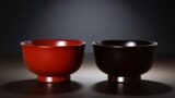
Japan is home to many traditional crafts that are admired around the world.
Each one is supported by the hands of skilled artisans and by a distinctly Japanese sense of beauty, bringing together practicality and aesthetic refinement at the dining table and in formal settings.
※For articles on traditional crafts, see the “Craftsmanship and Traditional Crafts Archive”
Among these, Kutani ware holds a particularly strong appeal both in Japan and overseas.
While fully functioning as tableware, it presents a striking visual splendor on its surface and has long captivated people around the globe.
In this article, we will explore why Kutani ware has been so beloved, tracing its history and background.
Origins and History of Kutani Ware
Kutani ware is said to have begun in the early Edo period, in the mid-17th century (1650s), in the Kutani area of Kaga (around present-day Kutani Town in Yamanaka Onsen, Kaga City, Ishikawa Prefecture).
There, porcelain stone—the raw material for porcelain—was discovered, and a kiln was opened under Maeda Toshiharu, the lord of the Daishōji domain.
The works produced at that time are later called Ko-Kutani (“Old Kutani”).
They are characterized by bold designs that fill the entire surface of the vessel, painted in deep greens, yellows, purples, and dark blues. The strong impression of Kutani ware as vividly colored porcelain is rooted in this early Ko-Kutani style.
A Ko-Kutani ware vessel.
Photo courtesy of the Ishikawa Prefectural Tourism Federation
However, the kiln at Kutani is believed to have ceased operation once in the early 18th century (early 1700s).
The reasons are not entirely clear, and this “blank” period remains in the history of Kutani ware.
In the late Edo period (roughly 1780s–1850s), kilns such as the Yoshidaya kiln were established in an effort to revive Kutani ware, and the production area began to flourish again. The Yoshidaya kiln developed the Ao-Kutani (“Green Kutani”) style, an aode palette that omitted red, and gained a strong reputation.
From the Meiji period onward (1868–1912), Kutani ware began to reach overseas markets and came to be widely known as one of Japan’s representative overglaze-decorated porcelains.
The history of Kutani ware is not a straight, unbroken line from its beginnings to the present day. Rather, it has grown through interruptions and revivals, with its techniques and modes of expression refined at every stage.
Kutani Gosai – The Aesthetics of Color
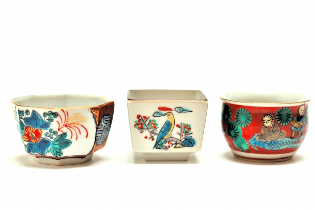
When people speak of the appeal of Kutani ware, the first thing that often comes to mind is its color. This bold, vivid use of color is the hallmark of Kutani.
Particularly distinctive is the palette known as Kutani gosai, the “five Kutani colors”: red, yellow, green, purple, and blue (dark blue).
These are expressed using overglaze enamels, glassy pigments that are fired onto the surface of the porcelain after the initial firing. The colors develop vividly on the glazed surface and give the pieces a powerful presence.
Each of the five colors is strong and saturated, yet together they achieve a subtle harmony. Through the repeated work of layering, letting colors bleed slightly, and carefully separating areas of color, the artisan builds a sense of richness and depth into the decoration.
This is why people often say, “There is no Kutani without overglaze painting.”
The vibrancy and impact of these colors draw the viewer’s eye in an instant.
A Wide Range of Designs and Motifs
The appeal of Kutani ware lies not only in its colors.
The wide variety of designs and motifs that unfold across its surfaces is another defining feature.
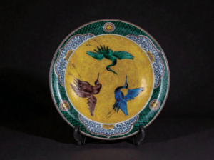
Birds and flowers, landscapes, and figures from stories and legends are common subjects, but the way they are depicted is far from uniform.
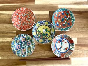
The diversity of designs and motifs is a hallmark of Kutani ware.
Some pieces are packed with fine detail, while others rely on daring compositions or bold color arrangements. These different approaches coexist naturally on a single vessel, and it is precisely this balance that gives Kutani ware its distinctive character.
Why, then, has Kutani become so diverse?
As noted earlier, the history of Kutani ware was not continuous from its beginnings.
It ceased once in the early 18th century and then was revived in the late Edo period (1780s–1850s). In the course of that revival, kilns changed, people involved changed, and the expressive ideals they pursued changed as well.
That accumulation of different attempts and ideas led to a range of styles emerging under the single name of Kutani ware, and to the breadth of designs and motifs we see today.
Representative Styles of Kutani Ware
Below are several representative styles that are essential to understanding Kutani ware.
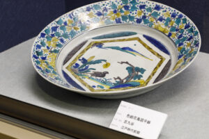
Ko-Kutani (Old Kutani)
Ko-Kutani refers to early Kutani ware, characterized by powerful compositions and intense colors.
Designs often include plants, flowers, and landscapes, with the five Kutani colors used to striking effect. It is regarded as a quintessential style of Kutani and remains highly popular.
Within Ko-Kutani, there is also the aode style, which omits red and uses four colors—green, yellow, purple, and dark blue—to cover the surface of the vessel. This style is notable for the way it visually “fills” the entire piece with color.
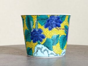
Ko-Kutani aode (aote) style, painted in blue, yellow, purple, and dark blue without using red.
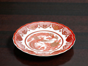
Mokubei
Mokubei is a style that spread in the early 19th century, in the context of the revival of Kutani, drawing on the painting style of Aoki Mokubei, a renowned Kyoto ware potter.
Many pieces feature a red ground over the body of the vessel, on which landscapes or Chinese-style figures are painted. The figures are often rendered with a certain charm and humor, which contributes to this style’s enduring popularity.
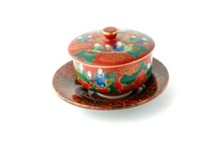
The “Mokubei” style, featuring Chinese-style figures painted on a red ground.
Yoshidaya
The Yoshidaya style represents one of the central streams of the revived Kutani tradition. It favors bright green as its key color.
Often seen as a successor to Ko-Kutani, it avoids the use of red and instead relies on green, yellow, purple, and dark blue to cover the vessel’s surface. Because the entire surface is built up with color, the outlines and placement of motifs stand out clearly, giving the work a heavy, dignified atmosphere.
The Yoshidaya kiln, emblematic of the revived Kutani ware tradition.
Eiraku
The Eiraku style is distinguished by a red ground over which designs are painted using only gold.
This type of overglaze gold decoration is known as kinrande: patterns rendered exclusively in gold on a red background.
Although its image differs from the multicolored impression many people associate with Kutani ware, it is nonetheless one of the representative decorative approaches within the Kutani tradition.
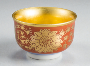
Eiraku style, distinguished by gold decoration on a red ground.
Iidaya
The Iidaya style is centered on red and is often what people mean when they speak of aka-e (“red painting”) in Kutani ware.
Iidaya red painting is characterized by extremely fine patterns drawn in thin lines, densely covering the surface of the vessel.
Arabesques, small flowers, and geometric motifs are intricately connected to fill the entire surface, with variations in the density of red adding depth to the design.
The overlapping layers of minute line work make this style a showcase for the precision of hand painting.
In Kutani ware, “aka-e” red overglaze painting usually refers to the Iidaya style.
Looking across these styles, it becomes clear that “Kutani ware” cannot be reduced to a single image.
The deep colors of Ko-Kutani, the red grounds and figures of Mokubei, the aode of Yoshidaya, the red-and-gold of Eiraku, and the dense red painting of Iidaya—within the single name “Kutani,” expression varies widely.
This breadth of expression is one of the great attractions of Kutani ware and a key reason it continues to draw people in today.
Tableware That Lives in Everyday Life
Kutani ware captivates viewers with its vivid colors, refined designs, and the meticulous skill of its artisans.
Yet it is not meant to be admired only behind glass.
Placed on the dining table, picked up by the hand, and used in daily life, its colors and patterns come fully into their own.
While fulfilling its role as tableware, it quietly adds a distinct richness to everyday scenes—that, more than anything, is why Kutani ware has been cherished for so long.
Kutani ware will no doubt continue to maintain its unique character and appeal, even as it rises to new creative challenges.
And its beauty will keep crossing borders, reaching and delighting an ever wider circle of people around the world.